ABOUT
The company provides a unified platform for investment accounting, compliance policy monitoring, risk analytics, portfolio reporting, and investment manager tools. It’s a leader in the industry and has many prestigious clients like large insurance companies, Facebook and J.P Morgan.
PROBLEM
Outdated branding: The existing website and branding was several years old, out dated and not user-friendly or responsive.
Too much old content that was no longer relevant: It was very difficult to find relevant content, and there was excessive amount of bloat, with over 650 pages.
Low performance: Research showed that users were leaving the site very quickly, with very low levels of engagement.

SOLUTION
Provide a clear and simplified overview of the product and demonstrating value for target market segments.
- Create an high level explaination of the product
- Simplfy the message
- Create curated content & reduce bloat
- Emphasis key marketing messages
- Lead users down 5 specific channels
UX Goals
- Retain users and help them find information quickly
- Help users get past the home page and get deep into the website to access the information they need with minimal clicks
- Improve the IA to simplify the structure and allow for consolidation of access content
- In order to create a positive experience for users, it was important we addressed and minimize the things that instigate negative emotions.
Information Architecture
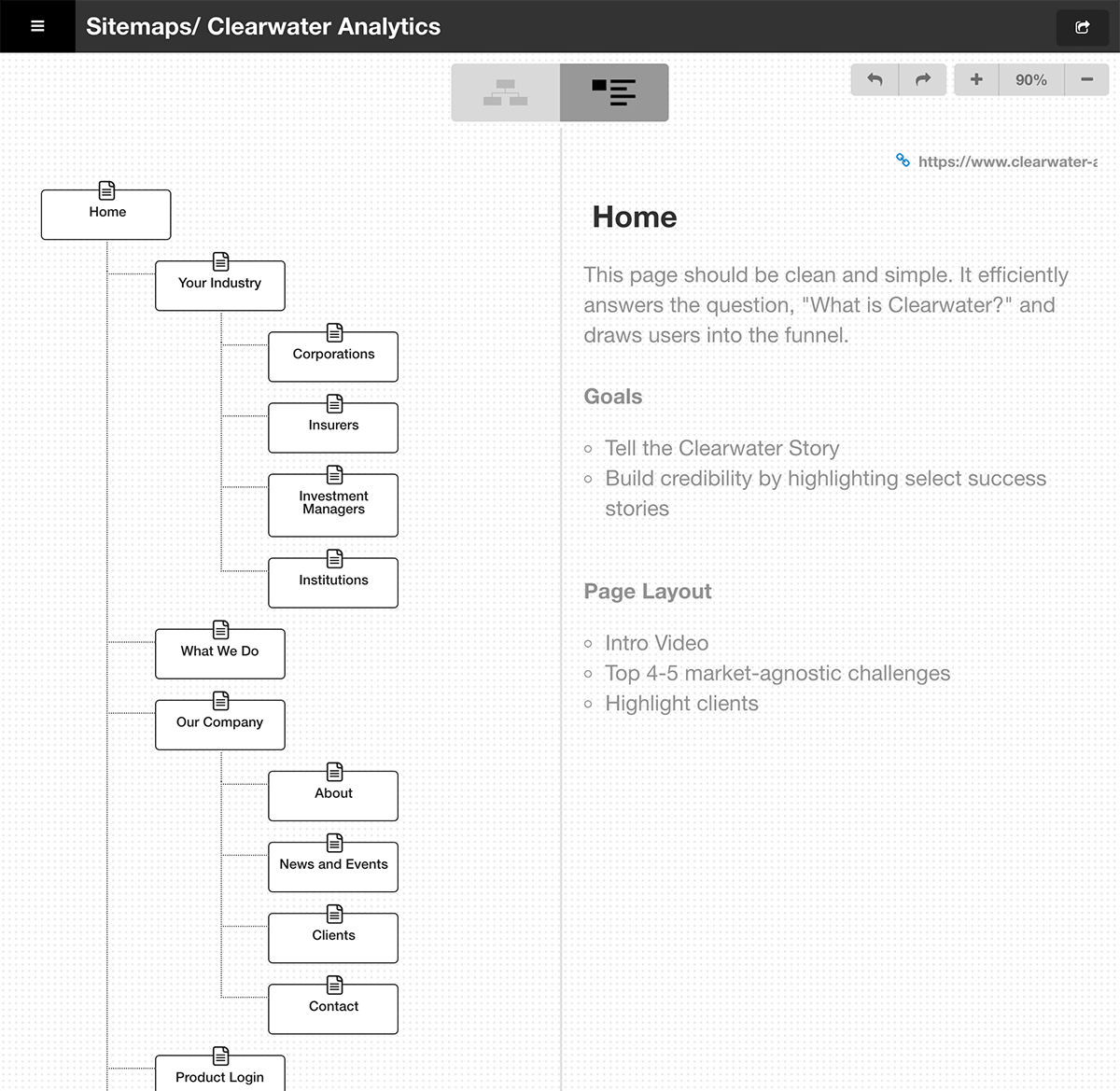
Powered by the research we conducted on current user activity, it became apparent that many users were unclear what exactly Clearwater does. We began by mapping the structure in a way that would make sense for users, and included a lot of detail about the goals for each page and ideas about how we would build that out.
In order to create a positive experience for our users, it was important we addressed and minimized things that triggered negative emotions or confusion.

Wireframes
I focused my attention on simplification and instead of showing absolutely every piece of information that we have about our product, attempting to be much more targeted towards key markets. I wanted users to have enough information about the company without overwhelming them.
User Flow
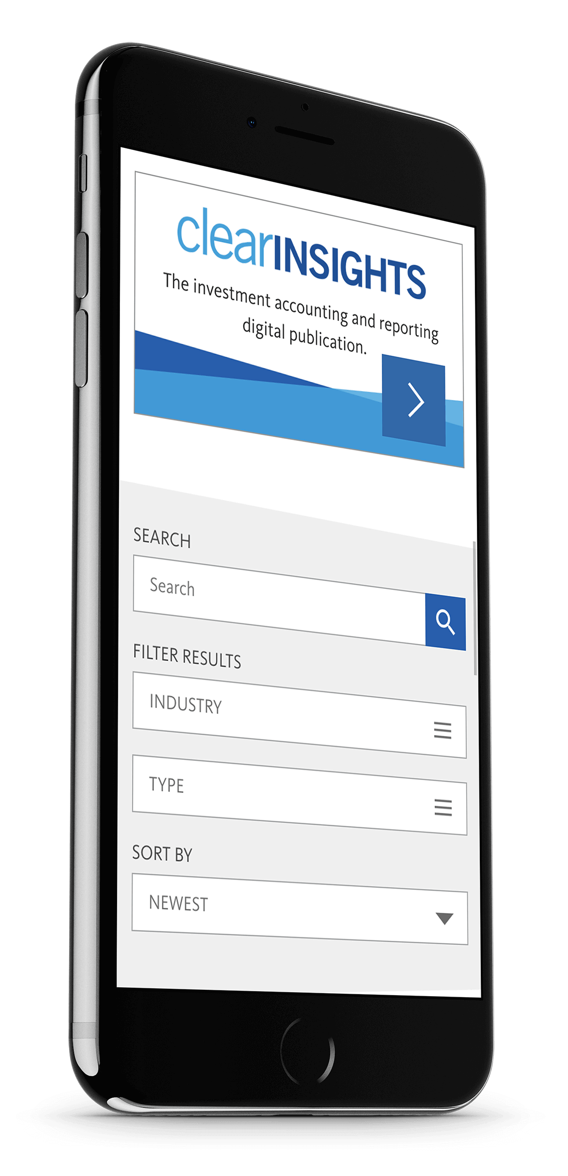
I created design mockups for mobile and tablet and brought them into InVision for user testing. We conducted some usability and A/B testing and refined the interface to better move users into key areas.
Design Solution
I worked closely with the content team to develop new content for every page of the site, so that I could tailor the design based on content. We went through a few design iterations and I worked with company directors and stakeholders to develop the design further.
The site was launched in April 2017 and has had a tremendous influence on the new direction of the Clearwater brand, inspring a new season of fresh design that is giving Clearwater the competitive marketing edge that it needed.
DELIVERABLES
- Wireframes
- Information Architecture
- UI Design
- Visual Design
- Branding
- Motion Graphics/Video
TOOLS
- Paper & pen
- Whiteboard
- Jira
- Sketch
- Illustrator
- After Effects


